As an Amazon Associate, we earn from qualifying purchases. Some links on this site are affiliate links at no extra cost to you. Our recommendations are based on thorough research and editorial judgment.

Color‑Blocked Walls and Nooks: Painting Strategies That Set a Mood
Color-blocked walls can jazz up any nook, turning drab spaces into fab retreats! Whether it’s energizing reds or calming blues (think Pantone’s Living Coral for a splash of cheer), choosing the right colors is key. Use painter’s tape for crisp edges—trust us, it’s a game-changer! Imagine a bright yellow entryway welcoming guests with pizzazz—who wouldn’t love that? Ready to learn how to conquer those color challenges? Stick around for even more vibrant inspiration!
Key Takeaways
- Use a maximum of three color blocks to maintain visual harmony without overwhelming the space.
- Combine bold colors with neutrals to balance intensity and create a welcoming atmosphere.
- Implement high-quality painter’s tape for clean edges and sharp lines during application.
- Consider the impact of lighting, as it drastically alters color perception and mood.
- Incorporate textures along with colors to add depth and richness to your designs.
Understanding Color Blocking and Its Impact
You may be interested


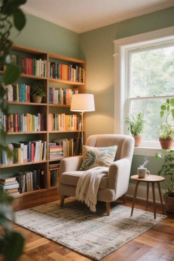
When it comes to sprucing up a space, color blocking is like adding sprinkles to a cupcake—absolutely fabulous! This vibrant technique uses solid blocks of color to create visual interest and separation, tapping into principles of color theory and design psychology. Imagine slapping a bold azure square next to a sunny yellow—wow! Colors do more than look good; they influence mood too! A calming blue can soothe your stressed-out soul, while a lively red might just energize your Netflix binge sessions. But careful now! Stick to three blocks at most to avoid overwhelming your space—think chic, not circus! So, nestle those textures together—mix matte blues with glossy greens—and watch your rooms dance with personality and flair! For those cozy reading sessions, consider enhancing the ambiance with book-inspired candles that offer calming scents like lavender and vanilla, perfect for creating a serene nook.
Selecting the Right Color Combinations

How can one truly select the right color combinations? It’s a vibrant journey through color psychology and color harmony! Start with the color wheel: blue and orange create a bold contrast—like Batman and the Joker, ready to energize your space! Or maybe you prefer soothing tones? Pair soft greens with calm yellows for a peaceful retreat—perfect for bedrooms! Think triadic schemes, like red, yellow, and blue, which offer a dynamic yet harmonious palette—the colorful equivalent of a superhero team-up! Remember, it’s all about balancing intensity: pair fiery reds with neutral tones to avoid overwhelming spaces. With the right blend, your walls won’t just look good; they’ll reflect your emotions and enhance any room’s purpose—like magic! When selecting curtains for your reading nook, consider breathable cotton blends as they offer comfort during reading sessions and contribute to a cozy atmosphere.
Techniques for Painting Color-Blocked Walls

Color-blocked walls can transform an ordinary space into an extraordinary showcase of personality and flair! To achieve this artistic endeavor, first prep those walls like a pro—wipe away dust and sketch your masterpiece lightly with a pencil. Now comes the fun part: using snazzy tape techniques. Apply high-quality painter’s tape, pressing those edges down tightly, because no one wants rogue paint sneaking through! For paint application, roll in a “V” pattern—think smooth jazz, not sticking a fork in the toaster. Did you know to remove that tape while still damp for razor-sharp edges? Voilà! With patience and creativity, you can turn a dull room into a vibrant, Insta-worthy space that even Marie Kondo would admire! For those interested in enhancing their room’s functionality, consider integrating stylish book storage solutions that offer both aesthetic appeal and versatile options to accommodate various storage needs.
Creative Applications in Different Room Areas
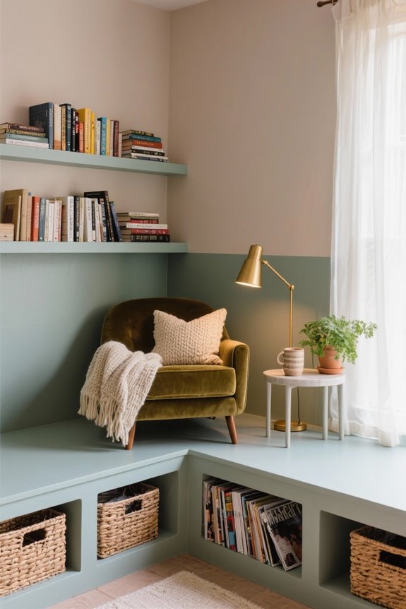
A fresh splash of color can turn any room into a vibrant canvas! In living rooms, high-contrast color blocks—think Pantone’s Classic Blue against bright coral—create dynamic focal points that energize social spaces. Bedrooms, on the other hand, thrive on soft hues like lavender and peach, which encourage relaxation and tranquility, establishing that much-needed personal retreat! For home offices, vibrant, contrasting blocks not only boost creativity but also delineate work zones, enhancing room functionality—can you say “work hard, play harder”? Kitchens benefit from two-tone walls, creating a cohesive design while making meal prep joyous! And don’t forget those entryways—bold colors set the tone for a stylish home; let that first impression WOW! Adding elements like high-density foam in bean bag chairs enhances comfort and style, making them a perfect addition to any color-blocked room! Who’s ready for a color adventure?
Enhancing Visual Interest With Layering

Three simple colors can create a masterpiece! By applying layering techniques, homeowners can transform a flat wall into a dynamic canvas. Imagine pairing a bold electric blue with a velvety matte gray—now that’s a showstopper! Texture variety is key; mixing finishes like satin and semi-gloss creates rich depth. Consider ombré! It’s not just for hair, but for walls, too. Gradually blending colors makes everything feel cohesive without sharp lines. Want to jazz things up? Layer with diagonals, creating an energetic flow, while cooler shades can fade into the background, framing warmer tones beautifully. So, why not release your inner Picasso? Your walls can be as vibrant and expressive as your favorite superhero movie—so get painting! Adding ergonomic comfort features to your reading nook can enhance the overall experience, making it a perfect haven for relaxation and creativity.
Balancing Bold Hues With Neutrals
Bold hues can ignite a room with thrilling energy, while neutrals serve as the ultimate chill buddies, providing a calming backdrop that keeps everything in harmony. Think about it—light gray, off-white, or creamy taupe can effortlessly support those bright yellows or deep blues! By blending cool and warm neutrals (like a cozy wool throw against rich burgundy), you create space magic—just like your favorite rom-com! Follow the 60-30-10 rule: dominate with a neutral 60%, add 30% subtler shades, and sprinkle in 10% bold accents for your ultimate palette party! A stunning emerald-green sofa against a beige wall? Yes, please! Embrace color psychology to energize your vibe while keeping things grounded with those neutral bases—talk about the dream team! Consider incorporating soft, cozy textures from high-pile or plush materials in your decor to enhance relaxation in any space.
Advantages of Color Blocking in Interior Design
When exploring the vibrant world of interior design, embracing the technique of color blocking can transform a mundane space into a visual feast! Color blocking enhances aesthetic cohesion, utilizing bold hues—like electric blue and sunny yellow—to evoke emotions and create functional layouts. Imagine a relaxed home office drenched in calming shades of teal, where productivity soars like a superhero! Conversely, warm oranges and soft pinks can spark lively dinner conversations in an inviting dining room. Plus, the magic of contrasting shades visually defines different zones, ensuring your open-plan living areas flow harmoniously! A compact design in furniture, like an armless reading chair, also complements the color-blocked spaces by efficiently utilizing limited space and adding style. So why settle for drab when you can optimize mood, delineate spaces, and exude style with a pinch of color-blocking prowess? Your walls deserve it!
Overcoming Challenges in Color Blocking Projects
Many homeowners commence on color blocking adventures with high hopes and dreams of transforming their spaces, but overcoming challenges along the way is just part of the journey—think of it as the ultimate interior design action movie! Choosing the right colors can feel like selecting characters for an epic saga—too many bold tones, like electric pink and neon green, can clash and confuse, creating a chaotic visual plot twist. It’s essential to evaluate the room’s function; bedroom serenity requires softer shades, while playroom vibrance thrives on lively hues! Don’t skimp on prep, either—sharp lines and balanced blocks elevate mood enhancement, creating aesthetic harmony. For those interested in adding creative elements to their spaces, consider incorporating a DIY Miniature Book Nook Kit to enhance the aesthetic and charm of any room. So, grab that painter’s tape and get ready to block your way to success!
Crafting Mood and Atmosphere Through Color Choices
Crafting the perfect mood using color choices is like being the director of your own feel-good movie—each shade plays a role in the emotional cast of your space! Think about it: warming hues like sun-kissed yellow (hello, happiness!) energize, while tranquil blues hug you with calmness—ideal for a cozy den. Color associations run deep; reds can spark passion (or anger, yikes!), while greens nurture harmony. But beware! Overdoing warm tones can mean a restless room, and cool colors may chill the vibe too much—like an emotionally distant movie character. Consequently, a splash of vivid orange with soothing lavender could strike the perfect balance. Incorporate string lights to add a warm, inviting atmosphere to your space, enhancing the mood you’ve crafted with color. Ready to paint your way to a mood that’s distinctly you? Let’s get creative!
Frequently Asked Questions
Can I Mix Patterns With Color-Blocked Walls?
Mixing patterns with color-blocked walls can create an extraordinary visual symphony, achieving stunning color harmony through thoughtful pattern combinations. Balancing sizes and intensities will prevent chaos, resulting in an enchanting, harmonious environment that invigorates any space.
How Do I Maintain Color-Blocked Walls Over Time?
To maintain color-blocked walls, regularly inspect for color fading and perform wall touch-ups as needed. Cleaning surfaces, applying protective measures, and using compatible paints can help preserve vibrancy and prolong the life of the colors.
What Tools Are Essential for Color Blocking?
Like a painter’s symphony, essential tools for color blocking include painter’s tape, high-quality brushes, and rollers. Mastering these painting techniques while understanding color theory guarantees vivid contrasts and harmonious designs that captivate the eye.
How Do I Incorporate Furniture Colors With Wall Color Blocking?
Incorporating furniture colors with wall color blocking involves ensuring furniture coordination through complementary hues, maintaining color harmony by matching shades, and using neutrals to balance bold walls, ultimately creating a cohesive and visually appealing space.
Are There Specific Color Blocking Styles for Small Spaces?
Like brushstrokes on a canvas, specific color blocking styles for small spaces employ minimalist techniques and bold contrasts. Horizontal bands enhance width, while vertical stripes create height, ensuring an inviting and visually dynamic environment.